
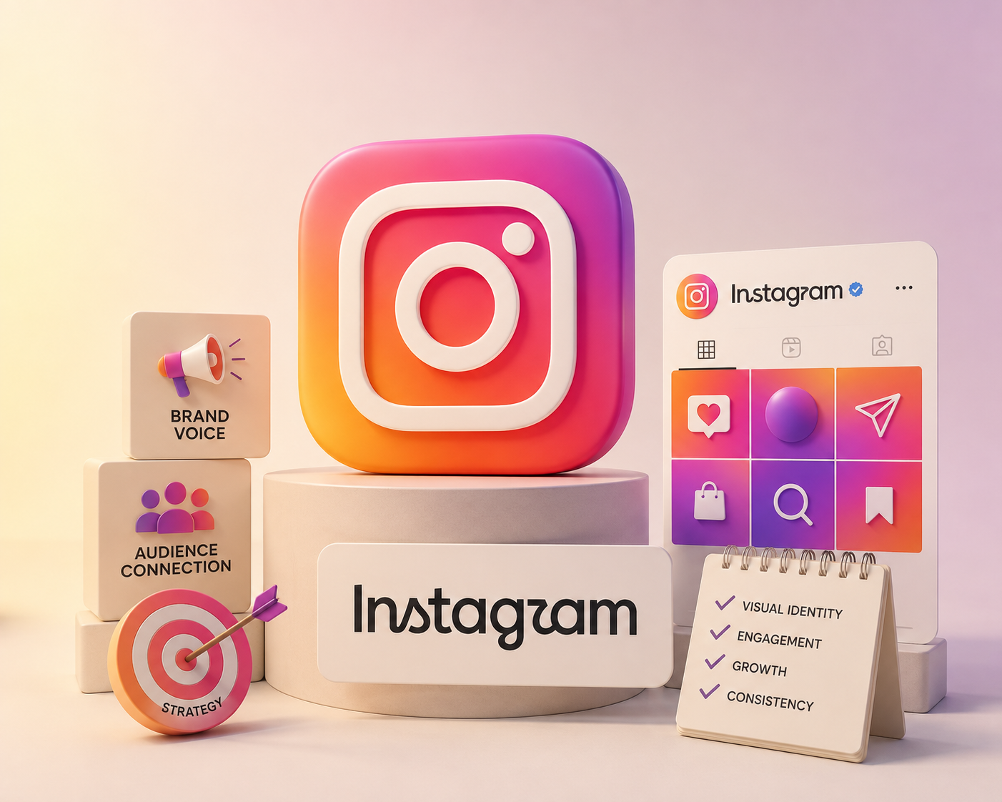
Instagram has a new look — at least when it comes to its name.
In August 2026, Instagram introduced a refreshed wordmark, marking the first major change to its written logo in around a decade. The familiar Instagram camera icon has not been replaced; instead, the focus of the update is the text-based logo and the broader visual identity surrounding it.
Instagram Head Adam Mosseri described the new direction as cleaner and more modern while maintaining a connection to the platform's original visual character.
But beyond the internet jokes, Instagram's 2026 logo update raises a much more important question for businesses:
What can brands learn from one of the world's biggest social platforms redesigning its identity?
At BIGBEANS DIGITAL, we believe the answer goes far beyond typography.
This is a story about brand equity, visual identity, social media branding, digital design and knowing when a brand should — or should not — redesign itself.
What Is the New Instagram Logo in 2026?
The new Instagram logo in 2026 is primarily a refreshed wordmark, rather than a replacement of the familiar Instagram camera icon.
Instagram has refreshed its text-based representation of the Instagram name. The familiar camera icon remains an important part of the brand identity.
The new Instagram text logo retains the recognizable handwritten influence associated with the previous wordmark but introduces a more contemporary typographic treatment.
Instagram is changing the way it expresses itself without throwing away the visual associations that billions of users already recognize.
A logo redesign can mean replacing an existing identity completely. A brand refresh can mean refining the existing identity while preserving elements that already carry strong recognition.
Instagram's 2026 update falls much closer to the second category.
What Does the New Instagram Wordmark Look Like?
The easiest way to describe the Instagram wordmark redesign is as a more contemporary interpretation of Instagram's familiar script-inspired lettering.
The previous wordmark was strongly associated with a continuous cursive style. The new version combines characteristics of cursive lettering with more structured, print-like forms, creating what can be described as a hybrid typography approach.
It is not a traditional serif-to-sans-serif transformation. It is not a complete move from handwriting to geometric typography.
Instead, Instagram is experimenting with a sans-serif/script hybrid visual language.
Differences Between the Old and New Instagram Cursive Wordmark
The biggest difference between the old and new Instagram wordmark is not simply the shape of individual letters.
Familiarity & Nostalgia
The old wordmark leaned heavily into a recognizable cursive character.
Modernization
The new version retains personality while introducing more controlled and simplified letterforms.
Instagram is effectively asking its audience to accept a new visual expression while still recognizing the brand they've known for years.
You have to change enough to demonstrate progress without changing so much that you lose recognition.
Why Did Instagram Change Its Logo?
The simplest answer is that the wordmark had been unchanged for about ten years, and Instagram felt it was time for a refresh.
But there is a broader strategic reason.
Instagram today is fundamentally different from Instagram a decade ago.
Its brand therefore needs to represent more than photography. It needs to represent creation, communication and self-expression.
The visual identity is evolving because the product itself has evolved.
Why Do People Call the New Instagram Logo "Instagzam"?
Shortly after the new wordmark appeared, social media users began joking that the redesigned lettering looked like "Instagzam" rather than "Instagram."
The criticism primarily focuses on the appearance of certain letters, particularly the redesigned "r," which some viewers find difficult to interpret immediately.
A wordmark has one fundamental job:
It should communicate the brand name clearly.
Instagram has enormous brand recognition, so most users can identify the word even when individual letters are stylized.
A smaller business may not have that advantage.
If customers need to spend several seconds figuring out what your logo says, the design may be sacrificing communication for aesthetics.
What Typefaces Are Used in Instagram's Brand Refresh?
Typography is one of the most interesting aspects of Instagram's wider brand refresh.
Alongside the wordmark update, Instagram has continued developing its proprietary typography system. The refreshed identity includes an updated Instagram Sans and introduces additional typefaces including Instagram Pen and Instagram Mono.
Instagram Sans
A flexible typeface supporting the broader digital brand system.
Instagram Pen
A handwritten voice reinforcing personal expression and creativity.
Instagram Mono
A more structured typographic voice for specific communication contexts.
A sophisticated brand can create a complete typographic system where different typefaces serve different purposes.
That is the difference between choosing a font and building a brand typography strategy.
Instagram Sans and Pen Typefaces: Why Typography Matters
Typography communicates personality.
Geometric Sans-Serif
Modern, technological and precise.
Handwritten Typeface
Personal, expressive and human.
Monospaced Typeface
Technical or editorial structure.
Typography System
Multiple voices working together inside one recognizable brand.
Typography influences:
The Adam Mosseri Instagram Update: What Does It Tell Us?
The Adam Mosseri Instagram update is important because it confirms that the change is intentional rather than simply an accidental interface experiment.
Instagram is not positioning the update as an entirely new brand.
It is positioning it as an evolution.
That distinction should be familiar to every business owner considering a rebrand.
What Instagram's 2026 Wordmark Change Teaches Brands About Redesigns
Businesses often believe that a rebrand means getting a new logo, choosing new colors and changing the website.
It doesn't.
A successful rebrand begins with strategy.
Brand Equity Should Be Protected
Instagram already has enormous brand recognition. Its name, camera icon, gradient and typography are deeply associated with the platform. Throwing everything away would create unnecessary risk.
A Logo Needs to Work in Digital Environments
Modern branding is primarily experienced through screens. A logo may appear on Instagram profiles, websites, mobile screens, digital advertisements, Reels, YouTube videos, email signatures, presentations and search results.
Don't Confuse Complexity With Creativity
The Instagram reaction demonstrates that a visually interesting design can still generate questions about readability. Good branding balances creativity, recognition and functionality.
Build a Visual Identity, Not Just a Logo
Instagram's refresh extends beyond the wordmark. Its broader system includes typography, gradients, motion and other visual elements. Your logo is the signature. Your visual identity is the entire language.
Modernization Does Not Require Forgetting Your Past
Modern branding does not mean every company needs to become minimalist. The right approach depends on the brand. A company can modernize while retaining elements of its history.
How Does Instagram's 2026 Rebrand Affect Marketers?
The impact is less about the logo itself and more about what it tells us about the direction of social media branding.
Instagram is increasingly a platform where brands compete through visual storytelling.
Your audience should ideally be able to recognize your content before they read your username.
That is the real power of a visual identity.
How Social Media Agencies View Instagram's Latest Typography Update
From an agency perspective, the Instagram typography update reinforces a broader industry trend:
Brands are building flexible visual systems instead of relying on a single logo.
For a social media marketing team, that means content needs to be designed as part of the brand rather than as isolated posts.
Should Your Business Redesign Its Logo?
Instagram's redesign does not mean every company should redesign its logo.
Consider a Logo Redesign If...
You Probably Don't Need One If...
Branding should follow strategy. Not trends.
What Should Businesses Do After Instagram's 2026 Brand Refresh?
Businesses can use this moment as an opportunity to conduct their own brand audit.
You may not need a complete rebrand.
You may simply need a stronger brand system.
What This Means for Businesses Looking for a Digital Marketing Agency
A modern brand cannot treat branding, social media and digital marketing as completely separate activities.
That is why businesses increasingly need agencies that understand both creative branding and digital marketing.
For companies looking for a digital marketing agency, the goal should not simply be to find someone who can create attractive Instagram posts.
The Right Partner Should Understand
The BIGBEANS DIGITAL Perspective
At BIGBEANS DIGITAL, we see the Instagram 2026 logo update as a useful reminder that branding is not about changing things simply to make them look new.
It is about evolution with purpose.
Instagram has enough brand recognition to experiment with its typography without needing to explain who it is.
Most businesses don't have that luxury.
That is why we believe a successful brand refresh should answer three questions:
What Instagram's New Logo Can Teach Us About Modern Branding
The Instagram wordmark debate may eventually disappear from social media.
People will get used to the new lettering. The jokes will fade. The new wordmark will simply become "Instagram."
Don't redesign because everyone else is redesigning.
Evolve because your audience, your business and your market are evolving.
Frequently Asked Questions
Is Instagram changing its logo in 2026?
Instagram has refreshed its wordmark in 2026. The update focuses on the text-based logo rather than replacing the familiar Instagram camera icon. The new wordmark is part of a broader visual identity refresh.
What is the new Instagram logo called?
The update is more accurately described as a new Instagram wordmark or new Instagram text logo. The camera icon remains a separate and recognizable part of Instagram's visual identity.
Why did Instagram change its logo?
The wordmark had remained unchanged for about ten years and Instagram felt it was time for a cleaner, more modern refresh while maintaining connections to the existing design language.
Why do people call the new Instagram logo “Instagzam”?
Some users believe the stylized design of certain letters makes the wordmark difficult to read, particularly the “r,” resulting in jokes that the logo reads “Instagzam.”
What typefaces are included in Instagram's brand refresh?
Instagram has updated Instagram Sans and introduced additional typefaces including Instagram Pen and Instagram Mono as part of the broader identity system.
Is the Instagram camera icon changing?
The 2026 update is focused on the wordmark. The familiar multicolored camera icon remains an important part of Instagram's visual identity.
What can businesses learn from Instagram's rebrand?
The biggest lessons are to protect brand equity, design for digital environments, maintain readability, develop a complete visual identity and make strategic decisions rather than redesigning simply because a trend has changed.
Does every business need a logo redesign?
No. A logo should be redesigned when the existing identity no longer supports the company's strategy, audience or digital requirements. Sometimes a brand refresh or visual identity update is more appropriate than a complete rebrand.
The New Instagram Logo Is Really a Lesson in Modern Branding
The new Instagram logo 2026 update may have started as a typography change, but it has quickly become a conversation about branding itself.
The debate around the Instagram wordmark redesign — including the "Instagzam" reaction — demonstrates just how difficult it is to change an identity that millions of people already recognize.
For businesses, that is the real takeaway.
Don't redesign because everyone else is redesigning.
Evolve because your audience, your business and your market are evolving.
Build a Brand That Works Beyond the Logo
BIGBEANS DIGITAL helps businesses build stronger digital identities through branding, creative design, social media marketing and digital growth.